Wednesday, January 28, 2015

Making Progress - the 1st floor


The house has looked like a disaster movie set for so long, that it's strange to finally start seeing it come back together. Even though many days creep by with almost imperceptible levels of change, looking at these pictures reminds me that we are actually making progress. I think it's important during the course of a major renovation such as this to periodically assess how far we've come. 

As you'll recall, here's what the kitchen looked like when we purchased the house:


Here's how it looked post-demo:


And, here's what we're working with today:


Walls, trim, and doors have all been painted (paint color: Benjamin Moore Simply White), eggshell for the walls and ceiling, semi-gloss for the doors and trim, hardwood has been repaired, though not refinished yet, doors to the storage unit have been removed, and all the electrical, plumbing, and gas lines are in place. 

Sometime this week cabinets should go in, for which I'm super duper excited. Shortly after that, the counters and barn doors will arrive. Can't wait!

I've selected a really pretty island counter slab, which is super white quartzite. It looks like marble, but you don't have to be quite as careful with it and it's not as prone to etching, scratches, etc. The stone people describe it as a combination of granite and marble. 

We're having it honed, and putting a super thick edge on it. I can't wait to see this installed on the island: 


The perimeter counters are absolute black granite, also honed and with a clean, thick edge. I'm really excited to see the two counter materials come together. 

In the powder room, the photos make it look like we've not made a ton of progress. However, the entire wall where the window is has essentially been rebuilt since we added a support beam going through it on its way from the upstairs to the basement, the wallpaper has been stripped, and the plaster walls have been skim-coated and primed. 


Next up for this room is adding some detail to the bottom half of the wall before we paint and wallpaper. I'm thinking molding of some sort, either traditional like this (but only halfway up the wall): 
Panel Molding & Wainscotting

or modern like this:
Modern board and batten for bottom half of powder room

The new fixtures are here - in the living room - where, you know, one keeps their extra sinks and toilets. So those can be installed anytime. Fingers crossed that it's soon!

The dining room has been painted, although we're going to have another coat applied just to make sure it's as deep and dark as it can be. The paint in here is Farrow & Ball's Hague Blue and I am completely besotted with it. 

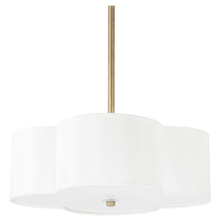
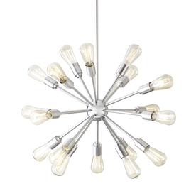
They also started this, which I've been dreaming about for at least the past year:


My Ralph Lauren constellation wallpaper looks seriously amazing in here, and once the light fixture is installed, this room is basically done - woo hoo! 

ralph lauren constellation wallpaper

The formal living room and front parlor have both begun to be painted. After much agonizing, I went with Benjamin Moore Revere Pewter here. 


It was a little tricky to get an accurate representation of the color, so here's a picture from another source: 

Revere Pewter by Benjamin Moore is the most popular paint color today because it's so versatile. Link to various spaces painted in Revere {Color Spotlight} The Creativity Exchange

We'll be using this color throughout much of the house, so I really wanted to get it right. Eventually I got so tired of staring at samples of slightly different greyish beiges that I finally just ripped the band-aid off and picked one. I feel good about the decision and think it's really going to complement the existing wood trim and new wood floors. 

They've also begun building out the structure on either side of the fireplace so our built-in shelves and rolling ladder can be installed. This is very much in progress so the new structure isn't painted yet, and the crown has been temporarily removed, but we're close to being ready to order the ladder and hardware, so that's exciting.

Also there's been some work done in the soon-to-be reading nook off the front parlor. The wallpaper has all been stripped, and it's been primed with the ceiling freshly re-painted. 

Next up in here will be building the window seat and bookshelves followed by wallpaper. I get so excited when I think about E seeing this nook for the first time. She's obsessed with butterflies, so I had to use Schumacher's Birds and Butterflies wallpaper in here:
Birds and Butterflies (Schumacher) $165/roll.

This has long been a favorite pattern of mine and I'm so thrilled to have the chance to use a special wallpaper in what I hope will become a really special little place for E. 

The rest of the 1st floor, including the hallway, office, and TV room have all been painted now as well, so apart from replacing a few sections of crown molding and refinishing the floors, those rooms are done too. 

Then, we can work on finishing the upstairs: I'll share more pictures of what we've done so far up there in my next blog. 


Saturday, January 24, 2015

Light Fixtures


Selecting light fixtures is, in my opinion, one of the most fun parts of home design. 
I'd compare the fixtures to your jewelry or accessories that you add to an outfit, and everyone knows that the accessories are always the best part! 


It was also relatively easy for me to make these choices, since I'd been looking at light fixtures for a LONG time, and pretty much knew what I wanted going into it.

I was keeping some of the fixtures in the house, but wanted to update the dining room, kitchen, mudroom, screened porch, powder room, master bedroom, master bath, E's bathroom, and the basement. Whew! That sounds like a lot when I list them all out.

First of all, the dining room. I like to create dining rooms that give guests a lot to look at and comment on. Since we're going with a super bold color scheme and wallpapered ceiling in here, the room needed a statement light fixture. I selected a sputnik chandelier in nickel, like this:
Style Selections 18-Light Brushed Nickel Chandelier

I considered painting it brass, but I decided that was going to be a little too matchy-matchy with the ceiling wallpaper in this room, so nickel it is.

The kitchen lights were a splurge, but I've loved them forever, so I knew I had to have them for this house. Above the island, we're doing 3 Thomas O'Brien Hicks pendants in oil-rubbed bronze/brass finish:
LARGE HICKS PENDANT
I love that they are round, since the kitchen is full of so many right angles and hard edges, and the mix of finishes is just gorgeous.

Above the dining nook in the kitchen, I went with a fun quatrefoil fixture with brass hardware:
Caldwell Pendant

I like how the brass ties it to the island lights, but it's a completely different shape and style to really set off the dining nook as its own little area.

The mudroom is so close to the kitchen that the light fixture here needed to play nicely with the kitchen lights, and I think this one is going to do the job: 

Feiss Lighthouse Collection Bronze Outdoor Hanging Lantern


I like that the hanging chain is reminiscent of the Hicks pendants, but this definitely looks like an outdoor fixture. The finish of this one should coordinate well with the top part of the Hicks pendants too.

On the other side of the mudroom is a screened porch sitting area, which I haven't really talked much about since we're basically doing nothing to it. It will be a 3 season room for us, and not too fancy with just a painted floor and ceiling, etc. 

I decided to install an outdoor ceiling fan here with a light to help make the room more comfortable in the dog days of summer. It's extremely difficult to find a clean, contemporary ceiling fan, and after looking and looking, I finally settled on this one:


I'm not in love with it, but it's fine and there was no need to go crazy on a fixture for one of the more secondary spaces in our home. 

Next, the powder room. I knew I wanted sconces flanking either side of the mirror in here, and they needed to be fairly quiet since we're going with wallpaper that makes a BIG statement in here (hello 18" running zebras!).

I found these cute little numbers on Joss & Main for a song, so I snapped them up:

Clemency Wall Sconce

I've mentioned that E's bathroom is sort of Parisian vintage, but I wanted to keep a balance in her room so it ties to the rest of the house and didn't veer too much into little kid territory. I went back and forth for a while before I selected this light:
 Pullman Bath Light - 3 Light

I love that it's a shiny chrome, and looks vintage but is not too sweet, so it can grow up with her a little bit. I am most excited to see how this one looks once it's installed.

In the master bath we're just doing recessed can lights, so no fun pictures to look at there. I chose a more ornate style for our medicine cabinets and wanted to keep the lines around them pretty clean so they will stand out, so no sconces or vanity lights are going in there. 

In the master bedroom though, we added an overhead light since there was not one previously. It seemed weird to me that you'd walk into a room and not have a light switch to turn on, so it was simple enough to have the guys add one since they were already doing tons of electrical work elsewhere in the house anyway.

I chose this glam flush-mount fixture that I think is going to sparkle beautifully when it's turned on: 

Possini Euro Geneva 16" Wide Crystal Ceiling Light
Finally, the basement. Most of the lights here are going to be simple recessed cans, but I am doing some fun fixtures above the bar, and in the game table area. Unfortunately, I don't have any pictures of them! They are oil-rubbed bronze and more industrial looking than what we're doing in the rest of the house, in keeping with the style of the basement decor. The fixtures are at the house now, so I'll try to remember to snap some pictures the next time I'm over there and will post them later. 

If I had an unlimited lighting budget I would have shopped exclusively from Circa Lighting. I think they have the best selection and I love the mix of traditional and modern they offer. However, only the kitchen pendants came from there.  I used quite a few sources for the other rooms, including Lamps Plus, Shades of Light, Joss & Main, and Lowe's. I found it helpful to start all my searches at Circa Lighting, narrow down the style I wanted, then look for similar options at some of the more affordable sources. It's crucial to have a good return policy wherever you shop since lighting is really hard to judge until you get it together in the house as well, so keep those things in mind if you're shopping for your own lighting! 

Tuesday, January 20, 2015

Choosing Tile

If you want to fall down a rabbit hole of seemingly endless options, shopping for tile is a good way to do it. There are so many really cool choices out there, and the style and design of tile that you choose can really change the overall feel of a room. Not only can you select from an almost infinite amount of colors, finishes, and shapes, but you can also spend a lot of time evaluating the installation design for all those tiles too, which can definitely change the impact your tile has. 

I began my search by spending lots of time on Pinterest and Houzz looking at installed tile in other people's homes. This was a good way to start narrowing down what I liked and then look for commonalities in the rooms that I chose as inspiration images. 

However, my hunt for the perfect tile really took off when I started visiting some tile showrooms and saw the tiles in person. I'm an online shopping pro, but there are some things that I really need to hold in my hands and see in person before I can pull the trigger on, and tile is one of those. I'd recommend this approach for anyone who is shopping for tile. Even if you don't plan to purchase from the showroom, it's still a great way to see what your options are and how the different tiles work together. 

With a large number of spaces in this house needing tile (kitchen, mudroom, master bath, E's bath, basement bathroom, basement bar), I had a fairly long list of styles I needed to select.

First, the kitchen. Despite being tempted by some gorgeous Walker Zanger tiles like these: 
granite counter top extended edge for stool to slide under

Walker Zanger tile - Apex Pattern in Calacata
Walker Zanger's Duquesa Alba Decorative Field in Mezzanote.

I decided to keep it simple. We have a lot of different finishes and design going on in the kitchen already, with a mix of marble and granite, painted and stained wood, brass, stainless steel, etc. So, although these tiles are certainly gorgeous, I decided they wouldn't really stand out in our kitchen like they should, and what a waste that would be. 

Ultimately I decided to go with a simple white subway tile with a dark grey grout:
Subway tiles with dark grout for definition - THIS for my kitchen (with open cabinets painted white, for sure.

laid out in a double-herringbone pattern to add a little interest, like the layout of the wall below on the left: 

Subway tile in Cloud white modern weave pattern for kitchen backsplash or bathroom tile ideas

Next, the mudroom. This is a small space attached to the kitchen, so it was important that whatever I choose here coordinated nicely with the kitchen colors. It will also be a very hard-working space since this will be our main entrance/exit to the house.  

I choose a medium grey wood-look tile that I think will work great here (I think the picture is my exact tiles), and it's going to be laid out in this right angle herringbone style:
Righy angle herringbone tile floor by Lindsay Redd Design

I'll probably go with a darker grout as I think the light grout will just get grimy fast in a mudroom. 

I've got kind of a French Vintage look going in E's bathroom, and I decided very early what tile I wanted for this room. I ended up selecting this cute vintage black and white tile, and I think it will look so great in her bathroom:

Merola Tile Metro Hex Matte White with Black Dot 10-1/4 in.x 11-3/4 in. x 5 mm Porcelain Mosaic Floor and Wall Tile (8.54 sq.ft./ca)-FDXMHMWD at The Home Depot
Making selections for the master bath was for some reason much, much harder for me than choosing tile for the rest of the house. Truth be told, I'm still waffling a little bit on what I choose, even at this late date. 

I think it's been so difficult because we have so many other big elements in the master bath. The shower, as you might recall, is a total showstopper:
Bailey474-2-e1339379718323

We are spending a lot to recreate this amazing shower, so I want to be extra careful that the tile design doesn't compete with/detract from it, but also that the tile looks equally cool and designed, not just like an afterthought.

I'm also a little bit concerned about all the different finishes happening in this room, so want to be sure it doesn't look like too much when it's all put together.

My plan right now is to use the same white subway tile from the kitchen with dark grout. We'll tile the shower like seen in the picture above, as well as the full wall behind the vanity, like this (we'll go to the ceiling, rather than stopping below like the picture shows):

master vanity.

Then for a little more interest, I'm adding Carrara marble octagon tiles, like this:


Master bath tile, but with black pencil tile instead of marble.

These will be on the shower floor as well as inside the inset shelves in the shower. I'm also considering incorporating black pencil tile (similar to the picture above, but solid black), but I need to work on the design for that a little bit more.

Lastly, the master bath floor outside of the shower, I believe, is going to be these large format Cararra tiles:
marble squares

The vanity surface will be marble/quartzite, so I'm trying to tie together black, white and marble in a way that looks elegant and not too busy. 

Lastly, the basement tile. For the bar area, I decided to use the same tile as the mudroom tile above. It should work really well with the metal, stained wood and concrete finishes I'm planning for the bar. 

I've always been a fan of black and white checkerboard tile, so that's what we're going with for the basement bathroom. Sort of like this:

An open floor plan and fresh white walls add a sense of spaciousness, while checkerboard floors and a claw-foot soaker lend vintage charm. |  Photo: Jill Hunter | thisoldhouse.com

I think I'm going to incorporate apple green into this room, so I think the black and white will really set it off nicely. It's a dramatic look for sure, but if you can't do that in a basement bathroom, where can you? 

Now that I've selected all the tile, I can't wait to start seeing it get installed...hopefully in the next couple of weeks I'll have new pictures to share! 

Saturday, January 10, 2015

The Before: The Basement

I've mentioned a few things that stood out to us when we were looking at the house that signaled we should get serious about it. But, I'd say the biggest "BUY ME!" sign was the basement. 

It was exactly what we were looking for (pictures taken after work started): 


I realize the pictures make it look like somewhere a serial killer would enjoy hanging out, but it's a complete blank slate, about 1800 square feet, with extremely high ceilings (nearly 9 feet!). Totally unheard of in a house built in 1925. 

We loved that there was enough room here to make it really special and finish it the way we want. 

I didn't take a lot of pictures, since how many pictures of an unfinished space do you really need? The notable things here are what the amount of space allows us to do, and all the basic structural things that need to be done to take a blank slate from this to this:
dark custom stain for the built-in maple media cabinets camouflage the TV.  stand out was the fireplace, which is surrounded with a white ledgestone marble-style tile and contrasts with the dark cabinetry.

We started work on the basement immediately after closing, because we knew that the structural things had to be done before we could actually start finishing. We installed a sump pump system in order to keep the basement dry, and also added a number of I beams around the exterior walls to ensure that they'd stay stable, since they'll be behind drywall soon. 

Filed under the category of "Least Fun Ways to Spend Thousands of Dollars" are a few other basement projects, including replacing the sewer line from the exterior through to the main plumbing stack (hence the jackhammer in the photo above), new windows, updating basically all of the plumbing pipes, relocating the furnace (surprisingly not as crazy huge a project as it sounds), and rebuilding the stairs so that the slope meets current building codes. 

Oh, and of course installing a support beam all the way through the house from the 2nd floor into the footings in the basement. Good times! 

But, with all that shoring up finished, we're able to start on the fun stuff. As you see in the picture above, the stairs previously turned at a 90 degree angle and opened into what will be the storage area. As we're rebuilding the stairs, they will now go straight down and open into a hallway. 

To the right of the stairs will be a doorway into the storage room, and another doorway into the new full bathroom we're adding down here. 

The storage room will just include your standard plywood shelves for storage. Nothing fancy.

The bathroom as well will have more basic finishes than what we're doing on the main levels (no Scalamandre wallpaper here), but I'm still hoping to make it nicer than a boring, builder-grade bathroom. 

Directly across from the bottom of the stairs will be entry into my new craft room. Nothing too exciting happening there, just reusing the furniture from my current craft room, carpet, and walls. I might paint it a fun color, but that's TBD.

Continuing down the hallway to the left of the stairs will take you into the bar area, which is going to be a nice big space with a full-size fridge, dishwasher, ice maker, etc. along with a wine storage area like this:

wine storage

I originally thought I wanted a full-blown wine cellar in the basement, and there was a little area already there that seemed like it would work. But, ultimately I decided we'd get more use from the square footage in other ways, so we're doing a more small-scale wine area. I think it will look great and I like how the above design allows for lots of attractive storage in a smallish area.

This part of the basement is primarily Brian's domain, so we're going with a more masculine/ industrial vibe down here, but which I also happen to really like. 

I love the bar below, and am going to have our contractors execute something similar but bigger that I design using corrugated metal, with a mix of wood, tile, and concrete finishes. 


corrugated metal for the bar but with concrete counter instead of wood

Adjacent to the bar area will be the TV/Family Room section. We'll do a set-up similar to the first inspiration picture above - huge TV on the wall, fireplace below, with built-ins all around. A big, comfy couch and ottoman will round out this part of the basement.

The red brick chimney you see above is in great shape and I was intent on keeping the brick exposed if we could figure out a plan that allowed that. I think we've got it, and so all the walls will be drywalled except the part with the brick. I think leaving it exposed will contribute to the overall aesthetic I'm going for, and I love the idea of a huge black and white photograph mounted on the brick. 

I thought it would be cool to do something fun with the basement art, and I think a big print of this Mark Seliger photo of Dre and Snoop would be awesome:


B doesn't think we're cool enough to pull this off, but we shall see (he's probably right). 

Continuing over to the other side of the family room area will be a nice big space for a poker table, as well as a future ping pong/pool table of some sort, and of course, the piece de resistance:


My Christmas gift from B :)

Beyond that, we're adding an exercise room with hopefully enough space for an elliptical and treadmill, as well as floor space for yoga/weights. We'll hang a TV on the wall, and install french doors with textured glass to let in some light. Let's face it, the exercise room is going to have some stiff competition when you have to walk past a Ms. Pac-Man machine every time you want to work out!

So, that's the basement, and that concludes the whole-house tour. Next time I'll talk more about where we are in the process today. Thanks for reading! 


Wednesday, January 7, 2015

The Before: Master Suite, New Laundry Addition, and E's Bathroom

Every contractor and friend/family member who looked at our house assured me they had never seen anything like the original bathroom situation on the second floor. 


The pictures don't really do justice, but what you're seeing is a jack-and-jill bathroom through the shower! It's bizarre. There were two little rooms with separate toilets and vanities with a wide open shower in between them. I cannot imagine under what circumstances you could comfortably have two people using that bathroom at once. 

It made no sense, and certainly would not work for our family, so we're taking this baby down to the studs, then re-building it into a luxurious master bath. Here's a few of our inspiration pictures:
master vanity.

bathroom wall with cabinets between mirrors - Google Search

marble squares

Love this tub

Basically going for classic materials (marble, subway tile, chrome fixtures, etc.) in shades of primarily black and white.

I'm 100% obsessed with this shower and am moving heaven and earth to recreate it, despite the complaints of my contractor :) 
Bailey474-2-e1339379718323
Most shower suppliers in Lincoln have looked at me like I'm insane when I tell them I want a custom surround fabricated, but I'm not giving up hope! It is a lot of effort, but I think the payoff will be an amazing focal point in the master bath.

I originally thought I wanted a freestanding soaking tub as well, but we just don't have the space here to get the look I want, so we're going with a drop-in tub. It will still be a nice, big soaker, but it will be framed in on the sides. 

We're still tweaking the vanity design, to try and make the most of the space. I am hoping we'll have room for a little makeup table station between two vanities

two vanities, makeup table in between

As much as I love our daughter, I don't what to share a bathroom with her if I don't have to...and fortunately we have space to add another full bathroom that will become E's bathroom in the big hallway next to the master bath. 

The picture below shows the hallway area, which is to the left outside her bedroom door. That open door will be walled off, and then another wall will be added perpendicular to that to make it an enclosed room. It will make the hallway a little darker because that window will now be in her bathroom, but I think it's okay.


E's bathroom will be a sweet little room for a sweet little girl - some retro touches with an adorable wallpaper including scenes of Paris. I'm so excited for this room to come together and hope she loves it:

Bailey McCarthy www.biscuit-home.com feature in February Matchbook Magazine | black white bathroom, ruffle shower curtain, claw foot tub, Paris wallpaper


wallpaper

shower curtains


Every older house I've ever seen has a laundry in the basement. It's not the worst thing in the world, but here we had a unique opportunity to move the laundry up to the bedroom level, so we're seizing it!  You can see the built-ins that were in place to the right in the picture above, and here's a closer shot of them:  


This would have been nice for storage, but I think I'll love a nice laundry right outside my bedroom door even more. So, these are getting torn out, and rebuilt to look something like this:  

Home and Other

A couple of small cabinets for the essentials, a shelf over the W&D for folding clothes, and a small space to hang things that air-dry. It won't be an enormous laundry room, but I am still thrilled at the prospect of not having to carry baskets up three levels every time I do laundry!

Lastly, the master bedroom. It's a large room with an interesting L-shaped layout which I think will lend itself to a nice sitting area in addition to the usual dressers and bed. 

This the room I've put the least amount of thought into in terms of how it will be decorated at this point. This is because I'm really torn - I love the light and airy look, but also like bedrooms to be a little more cozy and dark. So, we'll see where this one lands. I think phase 1 will be to just move our existing furniture and decor in, then I'll tweak it over time as I figure out what the design vision is for this space. 


There's also a nice, big closet that just needs some California Closets built-ins, paint, and new carpet to become really functional and most importantly, shareable, by both of us. Rarely do you see such big closets in older houses, so this was another sign that we should snap this house up! 


That completes the upstairs tour! Next time, on to the basement!