Sunday, March 29, 2015

The Dining Room

The dining room is one of the first rooms that we finished, simply because we already had all the furniture for it, and I had a vision for the design going back months - probably before we even bought this house. 


I've loved Farrow & Ball's Hague Blue for a long time and knew I wanted to use it somewhere in the house where it would really shine. It's such a rich, deep color and I love the matte "Estate" finish they offer it in. 


Along with the paint, I became obsessed with this Ralph Lauren Northern Hemisphere wallpaper and decided to use it on the ceiling. I have seen this wallpaper used on bedroom ceilings too, which I think is a cool idea, especially in a little boy's room.


This is a terrible picture - not sure why it looks so foggy, but in real life it's a perfect match for the Hague Blue walls and looks much clearer without all the weird marks than it does here. 

Once I had chosen the paint and wallpaper, there were just a few more details to work out, like furniture placement, lighting, and accessories. 

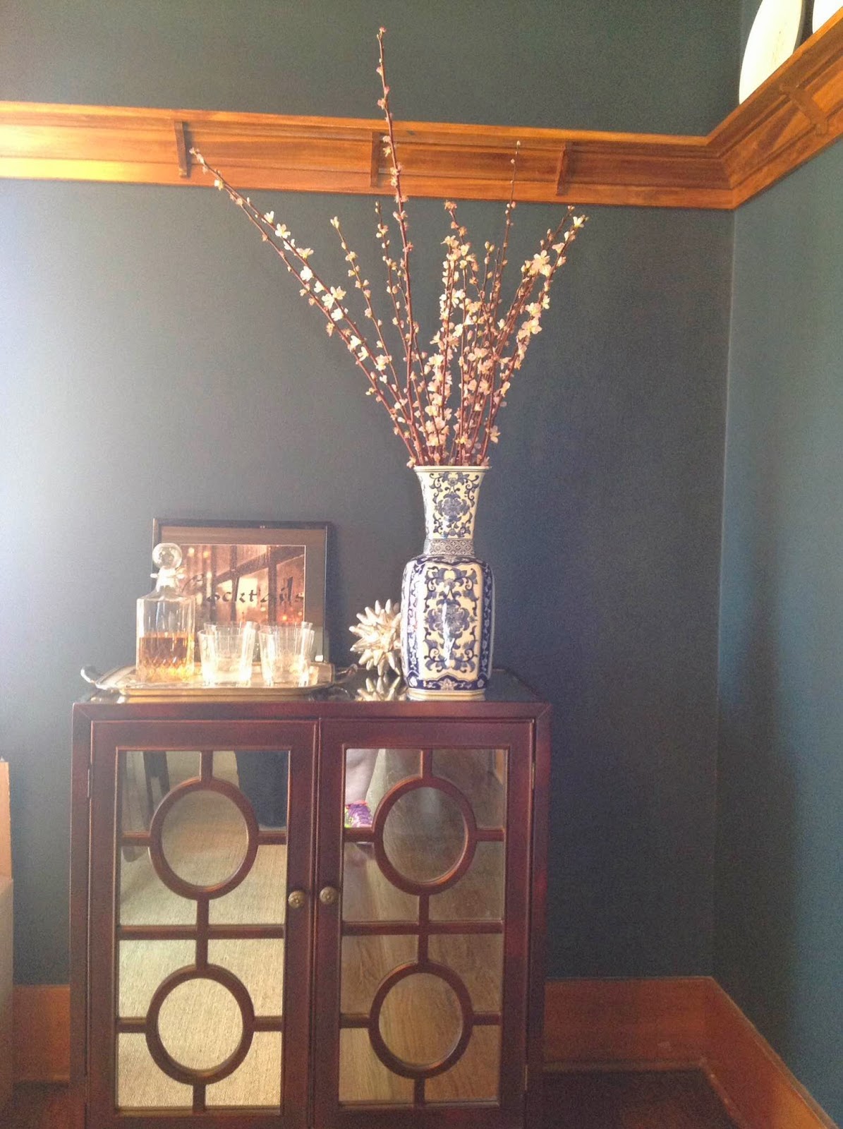
I love this little "Press For Champagne" artwork on our sideboard, which is actually a page I tore out of a mailing from Villa D'Este, a resort we stayed at in Italy a couple of years ago, and framed. I think it's so cute, and honestly, who wouldn't love champagne on demand?!


For now our bar is set up in the dining room, but I expect most of this (totally excessive amount of) alcohol will move to the basement once that's finished in a couple of weeks.

I knew I wanted a statement light fixture here, and ended up going with a silver sputnik chandelier. I think it ties into the constellation theme nicely and looks really cool with the edison bulbs. It's on a dimmer fortunately, since this baby gives off a lot of light. 


I struggled a little bit with what to do about the plate rail in the room. On the one hand, I really like the interest and character it adds to the room. It's original to the house and the wood was all in phenomenal condition - really not a mar or scratch anywhere to be found. On the other hand though, it makes it basically impossible to hang art in the dining room...which is a problem. I mean, I love my art, and I especially love to have eye-catching pieces in the dining room.


Ultimately I decided that the plate rail stays, and I am happy with that decision. Instead of hanging art, for the time being I have displayed my mother's china that I inherited (all 18 place settings!!!). 


The last thing to do in this room is window treatments, and I think I've settled on roman shades in this ikat fabric that I found a really long time ago:


I don't want this room to go too traditional, which I think could happen if I used a fabric that coordinates too much, and the yellow and blue really complement each other nicely. Although it's not an obvious choice, I think it will work out great when it's finished.

I think I'm also going to have these little side chairs upholstered in the same fabric as the window treatments.


Right now they are an orange velvet, which is pretty, but I think coordinating with the windows is the way to go here.

The last thing I did in this room was bring in a new rug, which you can see in the above pictures. I knew I wanted something with texture but no pattern, so I decided to just try this sisal from Ikea. It was dirt cheap, so honestly I didn't have high hopes for it, but I have to say I'm totally thrilled with this purchase. 

It is extremely well made and works perfectly in the room. I'm not sure how it will hold up over time (since it's only been in place here for about a month), nor would I necessarily recommend it for a high-traffic area, but for a dining room, it's a solid option. 

So, that's the dining room! Here's one last picture looking into the formal living room, so you can see how the two rooms relate to one another:  


Next time, I'm thrilled that I'll FINALLY be able to show our finished master bath! 


Tuesday, March 24, 2015

The Formal Living Room


The front door of our home enters right into the formal living room, so it was important to me that this room look really put-together. 

I also wanted something of interest since there's no central staircase or foyer in this home. My solution to the latter was to install floor-to-ceiling bookshelves, along with a rolling library ladder. I liked the idea of this room with the fireplace being more library in feel rather than a boring formal living room where no one ever goes. 

Here's a wide-view of the room:


The matching chesterfield sofas are blue leather and I absolutely love them. I've liked the chesterfield style for a long time, but you typically see these sofas in a brown leather. In this case, the blue color brings a nice jolt to the room and to me they are the perfect combination of modern and traditional that I'm always trying to find. 


The two brass side tables are from the old house, as is the rug. I'm not 100% convinced I like how the rug is working here, but I'm going to stick with it for a while and see. It's a large, heavy wool rug from Pottery Barn, so I'm not interested in jettisoning it right now, especially when I don't really have another place for it. 


The artwork is mostly all from the old house, and a mix of vintage and contemporary pieces, with the exception of the "Tokyo Is Yours" photograph which is one I took when we were in Japan last year and had blown up. 


I knew I wanted to do at least one gallery wall in this house since I love them so. In the old house I had a massive one with lot of different colors, styles, and mediums represented. I wanted to keep it a little cleaner and more curated here, so I went with a tight black and white color pallete. 


It took a lot of tweaking to get this wall arranged in a way I was happy with, but I think it finally got there. I know I'm far from finished buying art, so I tried to loosely arrange it with the idea that I can add more works as I add them to our collection without having to redo the whole thing.

The bookshelves are styled pretty, but the books are those we actually do/have read and love. Well, all except Infinite Jest. I've tried, but man I just cannot hang with DFW on this one. I'm keeping my copy though, and holding out hope that some day I can do it! 


These days most of my reading is done via ipad, but there's something about having physical copies of books around that I just can't get away from. In fact, I'm thinking seriously about getting hard copies of books that I've read electronically and loved. Maybe I'm crazy, but I like the idea of books as objects, even if I prefer to read them on the ipad.

Behind the bookshelves I layered in a pretty patterned wallpaper. You really can't see it unless you are up close looking at the books, but I like that it's a fun surprise when you see it, and it adds another layer of interest to the room. 


Facing the other way you see the front door, closet, and this area of the room:


I'm not completely satisfied with this part of the room, but it is what it is today. The console table is one I got at Pottery Barn years ago, and I still really like it. However, our moving crew dropped it and so now it has some big gashes and a chunk taken out of the wood. I'm sure it probably could be repaired, but since I've had it for over 10 years, I'm thinking maybe it's done its time and I should look for something new. Maybe a mid-century-inspired piece, like this one I spotted at Hutch the other day: 


I'd like to do two side chairs on either side of the console too, but they need to be interesting ones, possibly with a little pattern or a bright color. No boring beige here!
JARDIN faux bamboo SIDE CHAIR from Bungalow5. Also comes with arms and avail in several colors like navy.

Also notoriously missing from this room (and honestly, almost all the rooms) are window treatments. But, I'm on it. I found some gorgeous fabric from Gray Line Linen that I ordered and am having drapes made from. They should be finished in a couple of weeks and I think they'll set the room off nicely when they are done. I'm using the same fabric in both the formal living room and the parlor that you see here: 

Lastly, here's one more view looking into the front parlor/piano room: 


Friday, March 20, 2015

The Kitchen is Done!

Don't ever let anyone tell you moving is a good time. Wow, that was a lot of work - and there's still a LOT to be done! But, we are making some progress in getting things organized and decorating a few rooms at a time, so I thought I'd share some of that today. 

Getting the kitchen put together was, of course, at the top of the priority list right after E's room. I also received the fun news that our kitchen is going to be featured in some marketing done by our custom cabinet company, so that provided some extra incentive to get things moving in this room and make it look pretty. 

Here's a semi-wide shot of the whole room:


and just for fun, here's the same view from the before:


Just a few changes, huh?

I'm loving how this little breakfast nook area came out:


The upholstered bench brings a nice touch of softness and pattern to a room full of hard surfaces. The bench is the Ballard Coventry bench, and I'm really happy with it. 

Someday I may replace the table with the Saarinen table I covet, but for the time being, we've got the Ikea version there. I think it looks great and like that it's a modern, clean-lined table. It cleans up really nicely post-mealtime, and the center pedestal makes it easy to get in and out of the bench too, which is important. 

Display for some of my favorite cookbooks was something I knew I wanted to incorporate into the kitchen. We settled on this built-in bookshelf above the bench seat:


I like how this turned out and I LOVE having a place to display my most favorite and prettiest cookbooks. Even though most of my recipe-hunting these days is done online, I love using books as decor and having them to reference or jar my memory when I see them displayed. 

The little butler's pantry area is a nice space that we can use for drinks staging during parties and to keep some of our immense collection of glassware on display:


We keep some glasses in the dining room and some in the basement bar as well, but I like having our most-often used drink receptacles readily accessible here.

The cabinets, hardware, countertop, and backsplash are the same as used throughout the kitchen but we added these decorative corbels to this space to dress it up a little bit:


The island came out just as I'd hoped it would, and I just love it. The cabinets beneath have nice pull-outs so it's easy to keep everything organized. We built in this little microwave nook down at the far end and it includes space for our larger cutting boards, etc. in a really handy spot. 


I like the open shelves for glasses and mugs and I love that we were able to incorporate a ton of storage into the kitchen while still maintaining all the windows and keeping things nice and open-feeling. I think using glass fronts on the uppers really helps with the light and airy feeling: 


Note to anyone designing a kitchen: I'm 100% thrilled with my decision to go with mainly drawers for the lowers rather than cabinets. It's so much easier to find things, keep things organized, and get into and out of. I'd highly recommend this approach! 


The range is a 36" professional model and it definitely feels like a solid appliance that we'll have for a long time. The hood is totally functional, but I happen to think it looks really cool too. 


The tile backsplash is pretty, and I love the double herringbone pattern I chose, but there was a miscommunication between our tile setter and the GC so instead of the medium-grey grout I wanted, I got plain white. 

I was very annoyed at first, but it's one of those things that just happens in the course of a big job like this, and there's not really an easy way to change it (we'd basically have to rip all the tile out, re-drywall, then re-tile....so not happening) so I'm living with it. Anyway...

The sink is this enormous farmhouse sink with an apron front: 


I love having such a nice big sink for rinsing dishes, and the bridge faucet works perfectly with it. My only regret here is I opted to have the sprayer on the left rather than the right. I thought we'd like having it closer to the drain, but actually it's a little awkward since we are both right-handed. Oh well.

For the counter stools, I went back and forth, but finally decided to get these backless ones from world market:


I decided I didn't want to break up the line of the island by having barstool tops showing and I like that these tuck nicely under the overhang. They are really comfortable too!


Lastly, the workhorse of the kitchen is this built-in pantry:


We hide all the goods behind these enormous sliding barn doors and are able to store so much in an easily accessible place that is still protected from snoopy dogs and curious toddlers. I also really like the look of the barn doors and think they bring an interesting element to an otherwise pretty glam kitchen.

There's a possibility we'll remove this unit at some point down the road in order to open up the space more, but for now I'm glad we kept it and happy to have the storage.

Whew, that was a lot of pictures! Here's one more pulled back shot where I tried to capture the whole room:


We absolutely love this room and I hope you like it too!

Thursday, March 5, 2015

Home Decor That Didn't Make the Cut

I'm really happy with all of the decor selections I've made, and there's nothing so far that I'd change (thank god!). But, now that the decisions are made for most of the house, I've still got a long list of wallpapers, paint colors, fixtures, and other items that I love but that didn't make the cut this time. 

I figured I'd round them all up here so that I'll remember them when it's time to redecorate (just kidding B!) or in case any of you like my style and want some suggestions. 

First, this killer Jonathan Adler light fixture:
Lighting - Meurice Five-Arm Wall Sconce


Oh, how I love this. It's mid-century, without being quite as literal as some MCM pieces can be, and a little bit funky. It mixes well with transitional, modern, and vintage items, AKA right in my sweet spot. It's also totally fairly priced in my opinion at around $300. 

I wanted this baby BAD in my master bath, but the layout just wouldn't accommodate it. I would have just used one between our two medicine cabinets since it gives off a lot of light. I also think a couple of these would look gorgeous in a hallway or flanking a fireplace. There's also a 30-light ceiling version of this light that is pretty as well. 

Another light fixture I wanted to use but didn't is this amazing flush mount from, of course, Circa Lighting. 


Circa Lighting flush mount

It's seriously beautiful and would look great in a room where you don't want a large fixture that makes a big statement, but want something that brings more to the table than your standard builder-grade ceiling lights. It's a splurge for sure at $840, but it's so pretty I think it would be worth it in the right space. Actually, now that I think about it, I might need to swap out my boring office ceiling fixture for this one down the road. To be continued!

Last in the lighting category (although I could go on and on...I really love lighting) is this stunner from Kathy Kuo: 

Accordian Extendable Industrial Modern Billiard Island Light ($872)
If you had a smallish island that only needed one or two fixtures, I think this would be a beautiful option. It's so interesting and unlike any other pendant or island fixtures I've seen. 

I used several different wallpapers throughout our house, but there are still lots of rooms without any so maybe I'll still get a chance to use some of these beauties. In the meantime though, here's my list of also-rans. 

First up, this super fun option from Osborne and Little: 


So, those are chartreuse flocked silhouettes on a dark brown background. I get that it probably isn't for everyone, but I think in a playroom or powder room it could be amazing with lots of high gloss white trim and maybe a millwork chairrail? I think it would be great. Osborne and Little is a great wallpaper source with lots of really great non-traditional patterns so I'd highly recommend browsing their selection if you're in the market. 

Will someone with a long hallway, PLEASE install this adorable Fornasetti wallpaper? 


The pattern is called Multiplette and it comes in this cute navy/red colorway and there's a multi-colored option as well:

It's actually a border, about 18 inches high, but don't let that scare you - this is not one of the dorky old 90s borders you used to see! I think in a long hallway or even running along the bottom border of a kids bedroom, playroom, or basement this would be seriously cute.

I also am obsessed with this tortoiseshell paper and think it would look great lining bookshelves or as a bar backing, as used here.


bailey-quin-mccarthy-matchbook-magazine-6


It took me a long time to let go of this one...and truth be told I probably still haven't given up on the idea. For the longest time I've been obsessed with finding a striped carpet and then having it laid on the diagonal. Here's a shot of Lauren Santo Domingo's living room, where she did this to awesome effect: 


It's so unexpected and fun; I just love this idea. Since we have a ton of hardwood, and really only carpet in a couple of rooms, the stars just didn't align for this idea in this house, but I still think it's such a fun way to jazz up a carpeted room.

Oh, these Ochre horn pulls still haunt my dreams:


OCHRE - Contemporary Furniture, Lighting And Accessory Design - Horn Handles - Pale


They are just stunningly beautiful and I really, really wanted to install them on our high-gloss black vanity in the master bathroom. But, they are forged in England, only available to the trade, and I would have had to sell an organ or two to get them within the budget. 

Since I already was driving headfirst into the rabbit hole of my custom shower, I decided I didn't need to add any more fools errands to my plate, so I let the idea of these pulls go. But, I still super love them and if anyone I know uses them, prepare yourself for me to show up to your home uninvited so I can ogle them :)

I've got a list of about a million more things I love, but this would be a very long post if I put them all here. So, if you are interested in my input or need help making selections for your own home, I'd be happy to assist!

Hopefully in my next post I can start sharing some of the after pictures of the house as we work on getting settled in here.