Monday, March 28, 2016

Etsy Favorites - Artwork


Artwork is one of those things that I can't seem to get enough of. I have a ton of pieces, yet I always want more - either I get tired of a certain piece, I move the furniture around and then the art needs to change, or sometimes I have "placeholder" pieces that I like okay, but they are really just filling the wall until I find the piece I cannot live without. You know, like that little ol' Rothko above (#inmydreams). 

As addictions go, artwork is probably one of the more wallet-unfriendly ones. In general I think art is worth whatever it's worth to you and the artist, and in some cases that can be a lot of money. But, for certain spaces it makes sense to go with a more budget selection, and in that case I often turn to esty. 

There are a lot of great options to be found on etsy, either original artwork, giclees or prints. Here are a few of my recent favorites:

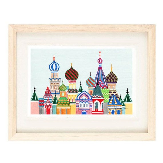
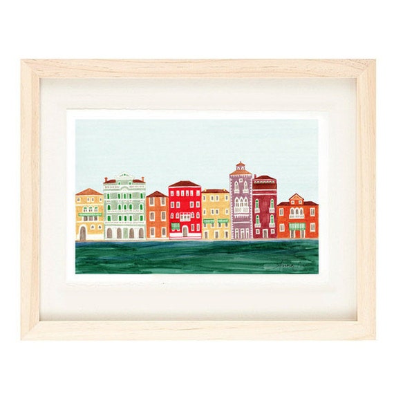
I think these city prints, from the shop Anna See, are so adorable for a kiddos room or playroom space. The use of a more sophisticated color palette really helps elevate these, and how much fun would it be to collect a cityscape for each place you visit as a family? 
MOSCOW, RUSSIA - Russian Architecture 12 x 18 Colorful Illustration Art Print For Home, Cathedral, Red Square Buildings
VENICE, ITALY - Colorful Illustration Art Print 11 x 17 Venetian Architecture Italian Design

Michelle Armas is one of my longtime-favorites, and I adore everything she does. I own one giclee of hers, and would gladly add many more to my collection. I love the unusual color combos she uses and how kinetic her work always seems. 

Halcyon Print


Dark n Stormy

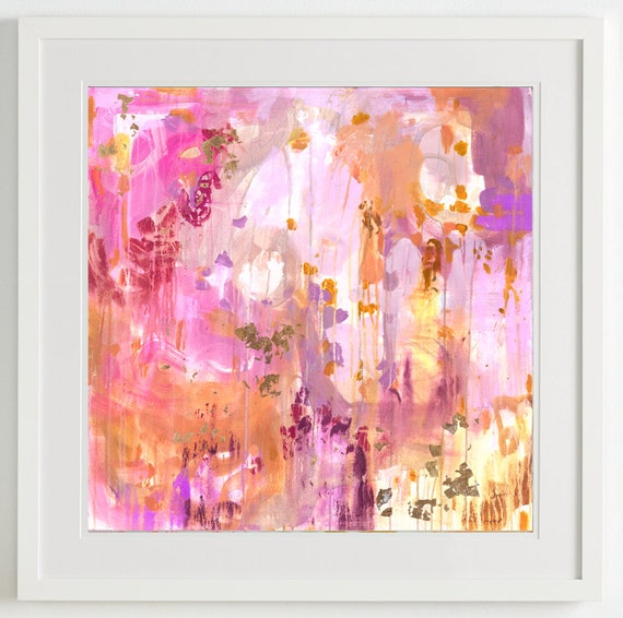
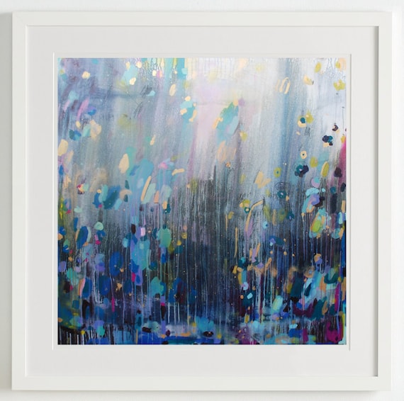
Emilia Kaminski also works in a similar lush style, and the movement and vibrancy in her works is what really appeals to me:
GREEN........original acrylic painting abstract art
HEROES......... original acrylic painting abstract art

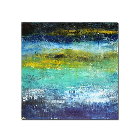
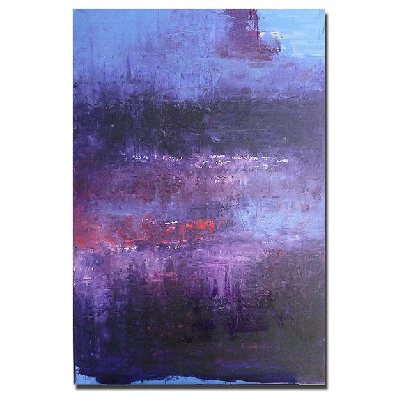
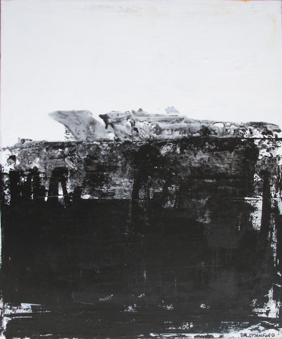
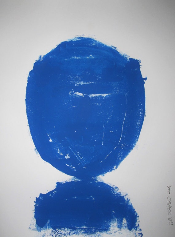
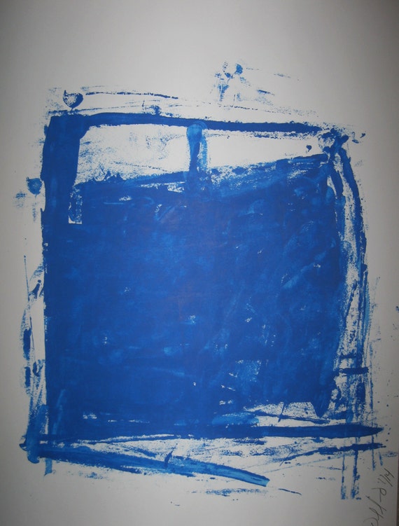
Factory Works is definitely more minimal and possibly more challenging to some, but I think these works are just super cool. These pieces are also insanely affordable for original works. 

I really love the black and white pieces here especially (and have one in my living room gallery wall), but the saturated blues are sure pretty too: 

Abstract Minimal Black and White No.0445 24x20 Acrylic on Canvas Modern Industrial

Abstract Minimal Blue No.0729 Ink on Paper 24x18 Modern

Abstract Minimal  Blue No.3440 Ink on Paper 24x18 Original

The works by Kai Samuels-Davis are sort of haunting and surreal, but in the most interesting way. I tend to like art that has a little bit of an edge to it, so these really appeal to me.

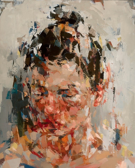
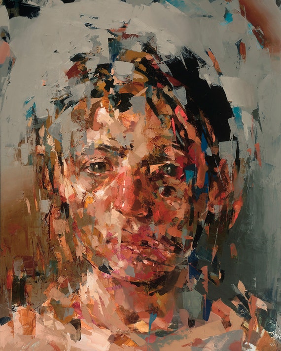
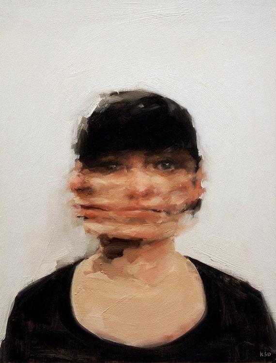
I own a landscape giclee by Samuels-Davis, but the portraits are really where it's at:

Into Unconscious, Giclee art print of original oil painting

Because the Night, Original Oil Painting

The Decision, Giclee art print of original oil painting


I absolutely love talking about (and purchasing art) so let me know if you have any questions! 

I will end with this recent art purchase I made; this piece by the Lincoln artist Dan Terpstra. Mr. Terpstra works in the medium of plywood and uses a chainsaw (!!!) to make the designs. The craftsmanship is incredible, and I think the pieces, especially the really saturated colors, are exceptionally beautiful.


Thanks for reading!


Monday, March 21, 2016

The Office - Almost There

Sorry for the radio silence over here, folks. I've been working on migrating to a new blogging platform, which it turns out is every bit as difficult and complicated as that sounds. Is there anything more annoying than trying to solve a technology-related problem? I swear, nothing makes me step out of my frame more than when the stupid printer doesn't work or when I can't figure out a simple website design issue. UGH.

Anyway, the new site is going to look really great, and will also have some fun new features, including possibly an online store (!!!) so I'm looking forward to unveiling it soon. Stay tuned. 

In the meantime, I've made some good progress on getting the office nearly finished, so I thought I'd share an update.


I previously posted a sort-of in-progress update about the office here, and since then I've been able to get a few of the larger items on the to-do list checked off.

Rewinding all the way back to when we first purchased the house, the office looked like this:


Fun fact: this was one of TWO rooms with inspirational sayings on the wall. 
This office is primarily a room for my use, but I didn't want it to feel too girly - I was going for more of a masculine/traditional vibe in here.

I pulled together a little inspiration board, which I also shared in a previous post, to help me identify what I wanted the overall look and feel of the room to be:


In the finished version, I think I landed pretty close to this. 

The draperies were custom-made from a Gray Line Linens fabric (my favorite source for solid drapery linen) and just perfectly graze the floor. I've talked before about how I usually like draperies to pool a little bit, but in a setting like an office I wanted a more tailored look. I hung them on simple brushed brass rods placed high and wide of the actual windows to let in the maximum amount of light.


This grey velvet chesterfield chair with brass nailhead trim was in my original inspiration board, and I really love it in the space (it's from here):


The brass floor lamp above is from Target, and it's pretty good. I wish it had a normal on/off switch instead of the weird floor switch it has, but overall it has the look I wanted.

I love that photograph, which was taken in the 1920s of an empty Grand Central Station, but it feels a little too small for the wall. I might swap it out for something of a bit larger scale. I have this larger piece elsewhere in the room, so I may just do a little switcheroo too.

Sorry about that glare! 


I'll most likely add some sort of side table near the chair, and possibly a small ottoman as well. I'm a little stuck on the finish for either of those items, as there's a lot of wood already in this room. I'll probably go with something in a bone inlay or white, like one of these options:

Bone-Inlay Side Table, Gray


The bookshelves are both functional and provide a space for some of my favorite decorative pieces. I primarily use the closed sections below for the ugly file folders and documents, with the open shelves being a space to keep the pretty things visible.


Fun fact #2: 4 is my favorite number, and B and my anniversary is April 4th, aka 4/4, hence the object above. 4/4 is also reportedly Jay-Z and Beyonce's anniversary - so you can bet that's going to be my opener if/when I get the chance to meet them. I'm sure they'll want to be best friends since we have so much in common.

Honestly, I probably do need to edit down what's on these shelves a little bit, but for some reason that is proving to be difficult in this room! 

The desk is angled in the room so I can see out the door, and also so there's no sunlight glare directly on the computer screen. I love having so much natural light in the room, but it can be a bit of a pain when trying to figure out a furniture arrangement.


I tend to more often go for a classical and symmetrical arrangement, so the furniture layout is something I could still see tweaking down the road.

Even with a few possible little changes still to come, it feels really good to have this room mostly finished. That leaves only the guest room to be completed (and it's basically done - just needs to be photographed). I guess it's time to start thinking about phase 2 :)

Thank you for reading!