First I want to clarify, this is in no way a criticism of the workmanship performed. I have exactly zero complaints about the quality of work and the follow-up done by our contractor. They were so super fabulous to work with, and I still text my main contact (I'm sure he loves this) with the occasional random handyman question, which he very graciously still answers. I live in fear of the day he deletes my number from his phone!
This is more about the aesthetic decisions I made around the design and/or functionality of the spaces that, having now lived with for almost a year, wish I would have done differently.
I should also say I don't mean this to sound at all "poor me." I recognize these are all first world problems and would hate for any of my comments here to ever be interpreted as though I am not thankful.
Okay, with that preamble, on to the kitchen:

Let me begin by saying I still absolutely 100% love this kitchen. Every time I walk in I practically need to pinch myself as I cannot believe it's mine. It was a long, long time coming, friends, with a LOT of cheap linoleum leading up to this point.

Of course all the major components of this room have stayed the same. No new counters or appliances :)

I like a pretty sleek, clean look for a kitchen, so as you can see in the photos I don't have a lot of excess stuff around (though I do have some). I love the strong black/white/grey color scheme, but felt that a little softness was needed, so I recently added this Moroccan runner (from Joss & Main), which I'm really loving:
 |
| Not sure why the floors look so light here - in person they are actually quite a dark espresso color. |

A few people have asked how I like having a big farmhouse sink, in terms of keeping the apron front clean, and I can confirm I still really love it. It's so pretty, and I still have a major hardware crush on the Rohl bridge faucet we used:

Here, however, is one thing that I would/might change. As you can see in the photo, I placed the sprayer on the left, which is also the side closest to the drain. I regret having not placed it on the right every.single.day! Both B and I are right-handed, and it is so, so awkward to try and use it basically diagonally stretching across the big sink.
It seems like that would be basically impossible to fix, unless I wanted to go ahead and drill a new hole on the right, but I may have just the solution. I originally planned to install an instant-hot water dispenser along with the regular faucet, but was worried it would look too cluttered and would detract from how pretty the faucet is. But, I'm over that now and think if I moved the sprayer to the right I could re-use the hole that is there now for the instant-hot dispenser. I haven't yet confirmed that with a plumber (#detailsdetails), but it's a possible solution for down the road. In the meantime, it may not function ideally, but at least it looks good:

As some of you may recall when I first posted about the kitchen, I was annoyed because our tile guy didn't talk to me before grouting the backsplash and just assumed I wanted white, when in fact I wanted grey grout.

I was mad at it for a while as I knew the white grout would get dingy and look gross, but I have to say, I now am really glad that the grout is white, and keeping it from getting dirty hasn't been an issue at all. I like how clean and crisp it looks, and how it doesn't make such a loud statement in the room. So although at one time I would have definitely included the backsplash on a list of "things I'd change about the kitchen" I'm now happy to say this is a keeper!
I also definitely still am happy with my decision to forgo most lower cabinets in favor of drawers:

I think drawers are SO much easier to keep organized and I like how this big block of them almost looks like a piece of furniture. Drawers are more expensive than cabinets, but I would definitely say this was money well spent.
The hardware is also holding up great, and have zero regrets about choosing the brushed brass finish:

We have a lot of windows in the kitchen, so not a lot of space for upper cabinets. This was actually totally fine by me as I don't particularly love a lot of uppers and think it makes the whole room look really heavy if it's lined in upper and lower cabinets (though I realize this is the only option for lots of kitchens in order to have enough storage).
We did incorporate this corner cabinet, which holds most of our china for daily use. I'm a bit of a china hoarder, so I store a few sets that are for holidays and special occasions in the dining room.

The floating shelves are looking a little empty because the dishwasher is full :) I know lots of people are scared of open shelving because of the dust issue, but I can say if you use them for things you use all the time, it's a non-issue.
The other main storage in the kitchen is the pantry, which is hidden behind the sliding barn doors:

The storage itself is quite functional and works well for us. The doors are a little tricky, as both E and Murphy can open them if there's even a small little gap left between them. I also wish I would have gone bigger with the handles. I think a really chunky handle would have looked cool here, but that is probably something I will not change.
As I've talked about before, the room behind the pantry is our TV room, and I think at some point when we are ready to do a Phase 2 renovation, which would include the back patio and garage, we might also open up the TV room and office into one large family room space with french doors leading to the screened porch. If we do that, we'll tear down this pantry (and carve out space elsewhere for a replacement), so I'm not super attached to it as a long-term solution.
I do love the symmetry of the three big doors (they are 8 feet tall) and the black hardware next to our Thomas O' Brien pendant lights:

We also have the small butler's pantry, that's across from the breakfast banquette, which we primarily use for wine/drinks when we have parties and for E's wipes - just keeping it real :)

One regret that I have in this space is that for some inexplicable reason, I decided to forgo under and in-cabinet lighting here. I installed it in the rest of the kitchen, but for some reason I didn't think we'd need or want it here. Big mistake. Huge.
I actually had our electricians look at it to see if there was any way to add it after the fact, and while technically they could do it, it would probably mess up the tile backsplash (and possibly the drywall underneath) and then we'd have to redo that too. That is something for which I have no appetite whatsoever, so I'll live with the lack of lighting here, but this is right up there at the top of my regrets list for real.
The banquette (from Ballard Designs) has been a real workhorse for us and has held up wonderfully. Not only does it get used by every family member all day long, but it's Murphy's favorite perch, and E's trampoline. It gets high marks for durability for sure.

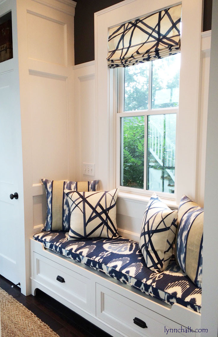
As you can see, I haven't installed any window treatments yet. I love how flooded with light the room is, which is why I have been hesitant to cover the pretty windows up with coverings. There also are 6 large windows in this room, so I knew whatever I chose would be expensive too. But, now that cold weather is here, I do think it could use a little warming up with some window treatments.
I love this Kelly Wearstler fabric, and will probably do roman shades in this or something similar whenever I decide to get going on it:
I've also been going back and forth on adding a few pillows to the banquette. I love the look of them, but am not sure we're old enough to handle having designer pillows in such close proximity to food. I'm sure E would be fine, it's B and me that I worry about!
If you're so inclined, you can see a few of the options I'm thinking about on my "Kitchen Banquette Pillows" pin board here.
The last thing I'm thinking about adding is some artwork around the bookshelf.

I feel like one or two well-chosen pieces between the shelf and the windows would look great.
I've been on the hunt for something simple, graphic, kitchen-appropriate (without being KITCHEN-Y, if you know what I mean - no EAT signs). I recently saw this amazing piece on one of my very favorite home blogs, the zhush, by the Italian artist, Enzo Mari:

I absolutely love it, and think it would look great in my kitchen, but of course when I find the perfect piece I am never satisfied and have to keep looking at a bunch of also-rans for a few months. So, we'll see - I may pull the trigger on this one, or may find something even more perfect!
I did, however, find and immediately purchase the perfect bowls for the most important (in his mind) family member and think they work quite nicely here:

So, overall we are very, very happy with our kitchen and love how it came together, but with a few small tweaks, it would be even more perfect. I hope by being honest about the details I would change I can help some of you who may be in the midst of your own renovations!

As always, thank you so much for reading!
This is such a great idea for a post! It's nice to be able to read what it's like to actually live in one of these gorgeous kitchen remodels you see online.
ReplyDeleteThank you! I am so glad to hear you found it useful!
ReplyDeleteThat is an amazing transformation. I would also have to pinch myself if that was my own kitchen. The space is amazing but I know how you feel about some aesthetic parts, I am always moving things around in my kitchen too. Great photos, I will be using some of those ideas very soon during our remodel.
ReplyDelete