Tuesday, April 19, 2016

Our Guest Room

I haven't shared our guest room on the blog yet, mainly because it was sort of the last refuge of unpacked boxes for many months after we moved in. But, as we finished up the other parts of the house, and had overnight guests coming in, it became more of a priority to spruce up this space a little.


It was easy enough to pull together since we already had all the furniture from our last house, and the room itself is a nice-sized, clean, bright room. We had this room painted along with the rest of the house before we moved in so that was done. This room is also the only room in the house that is carpeted (besides the master), and we kept the carpet as it was in perfect condition. 


The chair is from one of my favorite stores that is sadly no longer with us, Elan. This was definitely one of my first "good" pieces of furniture, and it has certainly stood the test of time, moving from a couple of houses and from room to room. It just goes to show that investing in quality furniture is usually a smart decision in the long run.

The brown silk draperies are the dupioni ones from Pottery Barn. 


My little shadow is always photobombing. 
The dresser is part of a set, and it is fine but not at all what I'd choose today. More on that in a bit! 


One of the things I really like about this room is I've incorporated a lot of meaningful pieces of decor in it. The birdcage above was used to hold cards at our wedding, and the little figure next to it was a gift I received from my MIL when I was pregnant with E. I've also got a few of our wedding photos and older family photos scattered around this room.


There's a tall dresser and a nightstand that match the longer dresser, and the headboard is upholstered in a neutral linen.

So, as I said, everything in here is in good condition and functions perfectly as is, but of course I like to think of the current state as phase 1 :) 

I know I sound like a bit of a broken record with my "phase 1" talk, but I do, in fact, have plans down the road to steal some square footage from this room to make the master closet (which backs up to this room) bigger. It only makes sense, since it's kind of a waste to have so much space allotted to a room that only gets used a handful of times a year. When we're ready to tackle that project, then this room will require some re-thinking.

At that time, I also would love to update the design of this room, as it's really not my taste anymore, nor do I think it goes with the rest of the house. It's got a few really special items, but also has become the place for pieces that don't have another spot. 

Obviously I have a lot of other priorities before I undertake a complete redo of a guest room that is functioning just fine in its current state, but when I am ready to take that on, I'd love to go in a very different direction with this room.

So, for a while I've been obsessed with the idea of a black bedroom. However, I know myself well enough to know I'd get sick of it in my own bedroom, and I'm really happy with the light, bright design I did in our master. But for a guest room? A guest room is the perfect place to go bold, and what is bolder than black walls? 

Here are a few black bedrooms that I love, that could serve as inspiration for this future re-design: 


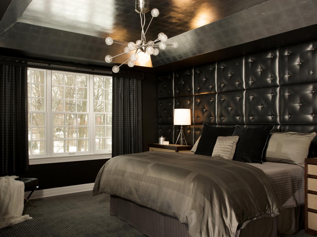
I love the black walls with crisp white trim here, and that light is amaze-balls. Also digging the metallic finish on the tray ceiling.


Tone-on-tone millwork and a crystal chandelier?! Yes, please!


This one is probably a little too goth, but I do love the black stained floor and the tonal wallpaper. 


Love the bed and bench situation here, and that the walls seem to have some texture to them.


My all-time favorite, by the insanely talented Jessie D. Miller . I mean, where to begin?! The artwork is stunning, the combination of ceiling medallion and that light fixture is ridic, and that brass bed?!?!


It takes my breath away. It's all super good, and I would like nothing more than to duplicate something like this in my guest room. The only problem with this plan is that I might end up liking my guest room more than my master!

Whatever I end up doing in this room, you can be sure I'll blog and instagram about it :)

Thanks for reading!

Monday, April 11, 2016

Dream Design - Decorating a Beach House

As I'm almost finished decorating my home (apart from a few minor things), I've been itching for a new project. I have a few friends whom I'm helping with various design questions, but I dream about taking on a whole house and going in a completely different direction than what I've done in this house.

Lately I've been seeing some really amazing options for a beach/lake house, so although I do not have one, I thought it would be fun to put together a design plan for this more casual and open space. 

You know, a quaint little weekend place like this:


I definitely think a beach house calls for an open and airy interior. After all, you don't want the interiors to compete with the outdoors and the views of the water and sand. To help achieve that openness, I think a very lightly stained grey oak in wide planks would look spectacular, like this:


The walls I would keep very clean and bright, perhaps in one of my favorite whites, Benjamin Moore White Dove

White Dove OC-17 Paint - Benjamin Moore White Dove Paint Color Details

With the floors and walls as a base, I'd bring in some blues, corals, and a lot of neutrals to keep things simple and bright. For the living room, I love this combination:


A classic white slipcovered sectional has covers that can easily be removed and thrown in the wash when they get dirty, making this a low-maintenance choice for a beach house. You can bring in color with the pillows, in a combination of blue and coral prints.

I love that spindle arm chair in denim blue upholstery to help ground the room, and would add a pair of those along with the sofa.

The rug is a playful blend of white, blues, and coral, and would really pop off the light grey floors. 

The side tables (by Arteriors) are of distressed wood but the glass top keeps them from looking too heavy. 

The linen-wrapped console with nailhead trim adds a bit of interest in a clean silhouette and I absolutely love that rattan mirror (from PB Kids, and a major steal at $149!) above it.

I'm envisioning a casual living/dining space that is open concept, so I kept the colors similar in the dining space as well:


If you own a beach house like the one above, you should prepare yourself for lots of weekend guests, so a super long trestle dining table is in order! This one has a similar finish to the floors, but is a little bit darker so it doesn't completely blend together.

Dash and Albert is the source for stylish indoor/outdoor rugs, and the pretty one above is no exception. I like keeping the rug in a darker tone for a dining space to 1) hide stains, and 2) really ground the space with a darker color. 

The blue definitely allows those AMAZING coral chairs (from Serena and Lily) to be the star of the show. These chairs come in a rainbow of beautiful colors, and for the truly brave I think having a hodgepodge of different ones around a table would make an incredible statement. Not for everyone, for sure, but for the right family and space it could look phenomenal!

That chandelier is another amazing PB Kids find (they are killing it lately). It's under 200 bucks and looks just as good as the circa one that costs 5x as much.

The last space I'll share today is a bedroom, for which I'd go a little quieter, but retain the same theme and colors: 


The rug in this space is a gorgeous option from Target, because if you're going to own a ten-figure beach house, you probably should economize somewhere :)

I love how it has the same colors as the rest of the house, but in different tones and proportions.

I love that beautiful rattan daybed that looks both luxurious and casual at the same time. I'd dress it up in coral-trimmed sheets with lots of white in the bedding and the bamboo dresser.

Those bedside tables also come in white, which of course would be a safe option, but the glossy blue is SO pretty I couldn't resist including a pop of color here.

An entire room in that Schumacher bamboo wallpaper would be too much for this space, but I'm envisioning it either in an adjoining bathroom, or possibly a feature wall in the room. It's just too perfect to go unused somewhere in this dream house!
Well, that was fun! If any of you need help decorating your beach house, you know where to find me :)

Monday, April 4, 2016

Our 1st Floor Powder Room

As I was going back through some of my older posts I realized that I never properly shared an update on the 1st floor powder room, which is probably the room in the house most likely to elicit a gasp when people see it. It's so much fun for me to see people's reactions to my design choices, and I definitely went for it in this room.


Unfortunately it's a bit tricky to photograph (at least for me) so the shots I have aren't great, but I was happy to find that I had at least one before photograph that shows a little of the transformation. 

The lighting is terrible, but if anything that helps the before look better: 


The window was basically hidden behind the really dated cafe curtains and blind, and the walls were done in a really bad burgundy faux finish. 

The pedestal sink doesn't look so bad in the photo, but it wasn't level and thus leaned off to the right quite a bit. The toilet isn't pictured, but believe me when I say it needed to be replaced. Big time.

The floor, however, was really good:


It's marble, and the herringbone pattern the tiny tiles were laid in is timeless. I really liked the floor and decided almost on the spot I wanted to work with it rather than tear it out. It did require a professional to come refinish and clean it, but ultimately it was worth it to keep this amazing (and, I believe, original to the house) floor.

Powder rooms are a perfect place to take some design risks and make a big statement. I knew I wanted to use wallpaper in this room and do something very special, nothing too boring or safe here.

I considered a lot (like alot, alot) of different options and probably ordered 10-12 samples, which I would hang up on the wall in here and stare at. I had always loved the iconic Scalamandre zebras, but you typically see that rendered in red a la:


A phenomenal look, to be sure, but not really in keeping with my color scheme of greys, greens, and blues. I should mention here, I don't necessarily think you have to use all the same colors in every room of your house. It can look fabulous to switch it up from room to room. But, in this house I wanted to maintain more cohesion and reusing the same colors in different shades and combinations was how I achieved that.

Anyway, I was thrilled when I found that the wallpaper was available in both blue and green, but after hours of staring at them both, I ultimately decided green was the winner. The color is super hard to photograph actually. It looks considerably darker in these photos than in real life, where it's a nice, bright green.


This one is a little closer to the true color:


We replaced the sink with an apothecary-style unit from Signature Hardware with chrome base and white porcelain basin. The faucet is a Rohl bridge faucet, in a more traditional style than the more modern one we put in our kitchen. The toilet is the same Kohler model we used throughout our home.


The sconces are simple silver with black linen shades, and I think I bought them either from One Kings Lane or Joss and Main.

The cafe curtains came down and I replaced them with a clean, bright white shade that goes top/down and bottom/up as I really like having the bottom of the window covered for privacy, but the top open so the light can come in. I talked quite a bit about window coverings for the house in this post.


You can also see in the above photo the millwork we added to the wall here. This entire wall was actually torn out and re-built due to some structural matters we had to correct. 

I think the tone-on-tone millwork looks really modern, but I always reserve the right to paint it out in the more traditional white down the road. For now, it's painted in Benjamin Moore's Martha's Vineyard, which is a color I think I'll remember for my entire life given how many different greens we tried to find a match for the wallpaper. This one is dead-on. 


One of the really nice things about this room is the huge storage closet that's in it, where we keep a lot of cleaning supplies and things we want easy access to for adults but not for the kiddo. I have recently organized and cleaned it out, but I don't think anyone needs to see the inside of my closet :)

The last thing I'd love to find for this room is a fun little faux zebra hide rug, which I think would be the ultimate finishing touch. If and when I find one, you can be sure I'll instagram about it. 

Until then, thanks for reading!


Monday, March 28, 2016

Etsy Favorites - Artwork


Artwork is one of those things that I can't seem to get enough of. I have a ton of pieces, yet I always want more - either I get tired of a certain piece, I move the furniture around and then the art needs to change, or sometimes I have "placeholder" pieces that I like okay, but they are really just filling the wall until I find the piece I cannot live without. You know, like that little ol' Rothko above (#inmydreams). 

As addictions go, artwork is probably one of the more wallet-unfriendly ones. In general I think art is worth whatever it's worth to you and the artist, and in some cases that can be a lot of money. But, for certain spaces it makes sense to go with a more budget selection, and in that case I often turn to esty. 

There are a lot of great options to be found on etsy, either original artwork, giclees or prints. Here are a few of my recent favorites:

I think these city prints, from the shop Anna See, are so adorable for a kiddos room or playroom space. The use of a more sophisticated color palette really helps elevate these, and how much fun would it be to collect a cityscape for each place you visit as a family? 
MOSCOW, RUSSIA - Russian Architecture 12 x 18 Colorful Illustration Art Print For Home, Cathedral, Red Square Buildings
VENICE, ITALY - Colorful Illustration Art Print 11 x 17 Venetian Architecture Italian Design

Michelle Armas is one of my longtime-favorites, and I adore everything she does. I own one giclee of hers, and would gladly add many more to my collection. I love the unusual color combos she uses and how kinetic her work always seems. 

Halcyon Print


Dark n Stormy

Emilia Kaminski also works in a similar lush style, and the movement and vibrancy in her works is what really appeals to me:
GREEN........original acrylic painting abstract art
HEROES......... original acrylic painting abstract art

Factory Works is definitely more minimal and possibly more challenging to some, but I think these works are just super cool. These pieces are also insanely affordable for original works. 

I really love the black and white pieces here especially (and have one in my living room gallery wall), but the saturated blues are sure pretty too: 

Abstract Minimal Black and White No.0445 24x20 Acrylic on Canvas Modern Industrial

Abstract Minimal Blue No.0729 Ink on Paper 24x18 Modern

Abstract Minimal  Blue No.3440 Ink on Paper 24x18 Original

The works by Kai Samuels-Davis are sort of haunting and surreal, but in the most interesting way. I tend to like art that has a little bit of an edge to it, so these really appeal to me.

I own a landscape giclee by Samuels-Davis, but the portraits are really where it's at:

Into Unconscious, Giclee art print of original oil painting

Because the Night, Original Oil Painting

The Decision, Giclee art print of original oil painting


I absolutely love talking about (and purchasing art) so let me know if you have any questions! 

I will end with this recent art purchase I made; this piece by the Lincoln artist Dan Terpstra. Mr. Terpstra works in the medium of plywood and uses a chainsaw (!!!) to make the designs. The craftsmanship is incredible, and I think the pieces, especially the really saturated colors, are exceptionally beautiful.


Thanks for reading!