Friday, December 26, 2014

The Before: Upstairs, E's Room, Play Room, and Guest Room

The staircase in this house is behind a door, which is kind of unusual. It's a more closed-in style staircase than what I normally prefer, and I was really attached to the idea of a big, open staircase nearer the front of the home. If given the option to change one thing about the house, this would probably be it. Nevertheless, I think it will actually be fine and once we add a fun stair runner I'm sure I'll like this area a lot more. 

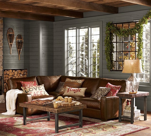
I think we'll do something graphic and black and white. Here are a few that are similar to what I'm thinking:


Once you come to the top of the stairs, there's a big, wide open space that has a ton of potential.


We're going to use it as the playroom for E (with the addition of a safety gate at the stairs, of course) for the time being, then most likely transition it to a sitting area once she's outgrown that. She's got some really big toys, so I think it will work really well for her since it's so nice and open. I also like that it's on the same level as her bedroom, so when she's a little older she can go back and forth between her room and playroom without going up and down the stairs. 

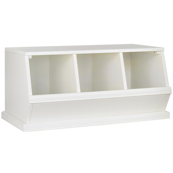
E's play kitchen will go in this space, along with a big comfy chair to cozy up for reading books, and some great storage for all her toys. I'm thinking something like the bins from Land of Nod will work well here:

3-Bin Palooza (White)

There's a guest-room to the left of the playroom area, which will be used as just that. Not a lot of updates are planned in either of these areas, just refinishing the floors to match the dark walnut color we're doing throughout, new paint to update from the tan neutral to a more grey neutral, and new window treatments. The guest room is carpeted, and the carpet is in great condition, so we're just going to leave that as-is for now. 


A little further down the hallway is E's room. This is a sweet room with slanted ceilings and great light. It will be painted a pale pink color from its current yellow. I think Benjamin Moore Ballet Slippers will look so pretty with the white trim in this room and is the perfect pink for a little girl's room:


That covers the easy part of the upstairs. Next time I'll talk about the really complicated stuff we're doing up here in the master suite, new laundry room, and E's bathroom. 

Thursday, December 18, 2014

The Before: The Kitchen and Mudroom


When looking at this house for the first time, one of the things that really stood out was the generous size of the kitchen, and the great light it gets from all the windows. It was big enough to really be a nice room with the addition of some higher-end finishes, and right away I started scheming how I could bring it up-to-date. 


Even the original layout was pretty good, with a decent-sized island, room for a breakfast nook, and a not-too-crowded workspace.


The plan here is to basically rip out everything. I realize this might sound drastic given that the room doesn't look so bad in the photos, but the cabinets are very cheap laminate, as were the counters. I think it can look a lot better, given the bones we have to work with. 

Here's some of our inspiration shots: 
cabinet details

Classic Kitchen Pendant Lighting: The Hicks Pendant


The lovely and talented Christine Dovey / designer - Chicago house// love everything about it, and thank her for telling me that the pendants are Visual Comfort Hicks large pendants from Circa Lighting.

I'm definitely going for light and airy, with grey cabinets, marble (maybe quartzite) counters, professional-grade appliances, and upgraded lighting. 

We're definitely using the Hicks pendants in here, as pictured above in rubbed bronze and brass. I love them and think 3 of them centered above the island will look stunning! 


I also am strongly considering using brushed brass hardware for the cabinets. I really like the look of it with the grey, but am just a little concerned it might feel dated in a few years. But, hardware is easy enough to change so long as it's not a funky size. We'll see.
Lewis Dolin - Round Bar Pull - 3 inch (76mm) Centers Round Bar Pull in Brushed Brass - ( 31-112 )

We'll do an apron-front sink with a modern bridge faucet, and pro-style appliances, including a 36" range and a big ol' hood. 

Given the number of windows in the kitchen, there's not room for a lot of upper cabinets, which is fine by me. We're squeezing in one corner cabinet and two narrow ones on either side of the stove ,and that's it. I think it will be plenty of storage though, given all the other areas we have in the kitchen. I am also doing almost all drawers for the lowers, as I think they are so much easier to organize than big cabinets.  

This hutch is getting torn out and replaced with more of a butler's pantry, with open cabinets above for storing glassware, and closed storage below. The finish will be the same as the main kitchen cabinetry, with marble (or quartzite) as the top. 


Right across from this hutch is the breakfast nook (not pictured). It's large enough to do a corner bench with a round table for extra seating. I think the bench will be this one from Ballard (still deciding which upholstery to use), and I'm on the lookout for a vintage Saarinen table like this (fingers and toes crossed I find one that doesn't cost fifty million dollars):

Coventry Sectional: Corner Bench, 48" Bench and 48" Storage Bench

Lippa 47" Dining Table EEI-1131-WHI by LexMod

One area of the existing kitchen we're keeping is this built-in pantry unit. We are, however, removing the doors and adding sliding barn doors to the front. This is an area where I wanted to save some money, since there's the chance we'll tear this wall out someday (the TV room is on the other side of this unit) so I think the barn doors will make it look a little more modern it while allowing us to keep using it as storage for the time being. 


The back door you see in the above picture leads out to the screened-in porch. 

It looks a little rustic for now, but I've got big plans. We're drywalling off a portion of it to make a mudroom, since this will be our main entry to the house (from the garage/driveway), and it's big enough that we can do mudroom on one side and still keep enough space to have a nice sitting area on the other side. 

The mudroom portion will look like this when it's finished:
IMG_1297-1.jpg 1,067×1,600 pixels

I love the mix of stained wood and white here, and want to do something similar, with lots of hooks and easy-to-get-to storage. No excuses for just throwing the coats in a pile anymore!

Demo is basically done in the kitchen, here's what it looked like the other day: 


We've obviously got a long way to go, but it feels good to see progress! 

Next time we'll go upstairs to the bedrooms, playroom, and master bath.

Saturday, December 13, 2014

The Before: Powder Room, Office, and Family Room


The layout of the back half of the house is going to work really well for our family. There's a powder room, and 2 additional bedrooms (both with very nice-sized closets: score!). Of course we're not using the downstairs rooms as bedrooms, but we have other uses in mind. 

First, the powder room:


Not so pretty in its current state, for sure. But, I love the light, the fact that it's a good size, and the marble herringbone floor is GORGEOUS. Not to mention, in remarkably good shape for such an old house. We're designing around the floor, as I really want to keep it. I think with a good cleaning and polishing, it will look better than new.


We're going to swap out the janky pedestal sink for a more updated console sink, possibly something like this:


I won't go into detail, but trust me when I say the toilet definitely needs to be replaced as well. I think we'll go with a simple Kohler model:


There is a cast iron tub that is staying. I think we might regret converting a full bath to a half-bath if we don't have to, and moving cast iron is no joke. So, we'll do a pretty shower curtain situation around it and pretend it's not there.

I'm doing a fun wallpaper in this room, I think the Scalamandre Zebras in green, and doing the trim in a high-gloss black. I think it will look lovely with the original floors and hits all the glamorous-with-a-bit-of-weird notes I'm trying for in this design.

Next to the powder room is the bedroom we're using as an office:


Since I work from home, I need a space where I can close the door and put my head down and work. This room is a nice size, has good light, and just needs new window treatments and paint, and the removal of the bizarre inspirational saying, which is actually one of two such inspirational quotes on walls in this house. No biggie.

Next to the office is the Family Room. It's housing the piano now, so ignore that. It's small, but will be fine since we're doing a larger Family Room setup in the basement. There's enough space for a comfy sectional couch and a TV/console. I'll probably add another table of some sort, but need to be careful about the arrangement since this room will definitely serve as a pass-through from the kitchen to the other side of the house. I like that this room is right by the kitchen.


I think at some future point we might tear down the walls between these two rooms and the kitchen and make the whole space a really open family/kitchen area; perhaps when we no longer need/want an office in its own room. However, that is likely a while down the road.

Okay, next time I'm going to tackle the big daddy: the kitchen! 


Tuesday, December 9, 2014

The Before: Entry, Formal Living Room, Parlor, and Dining Room


There isn't a defined entry/foyer in our home, which I'm not 100% thrilled about. All throughout our house hunt I was intent on having a grand staircase that opens into a foyer. This house doesn't have that layout, but you enter the home into a nice, large formal living room, so I think I can carve out a space to function as an entry and make it work. 

The FLR currently has a really pretty fireplace (to which the previous owners added a godawful electric insert for some reason - we're pulling it out) with built-in cabinets flanking it on either side.


I think the nooks on either side of the fireplace will greatly benefit from some wallpaper action and shelves built to the ceiling. 

My very favorite thing we're doing in this room (quite possibly my favorite thing in the whole house), is we're adding a rolling library ladder, which will go across the full width of the room, from one bookcase and across the fireplace to the other. I think it will look super cool, and will provide a dramatic focal point right when you walk in. It might make the furniture layout a little tricky, but that's a trade-off I'm willing to make. 

To the left of this room is the room we're calling the parlor, for lack of a better word:

It's really another sitting room, slightly smaller than the FLR. This room just needs some paint and new window treatments. We'll use this as the piano room, and will likely add a pair of chairs in front of the windows. I'm thinking either overscale wingbacks, or maybe the umbrella chairs from Restoration Hardware. They don't really go with the style of the house, but I've loved them forever and think this might be just the place for them.

My favorite detail about this little room is the closet/nook: 


I wracked my brain trying to figure out what to do with this space, before I finally came up with what I think is the solution. We're converting this into a fun little reading area for E, with a built-in window seat, bookshelves, and some super fun wallpaper. I hope she loves it.

Back to the right of the FLR is the Formal Dining Room:

This room is going seriously glam. It's getting Farrow & Ball's Hague Blue on the walls, and Ralph Lauren Northern Hemisphere wallpaper on the ceiling. I can't wait. Also, that sad little light fixture is getting swapped out for a swanky sputnik chandelier. 

In my next blog I'll talk about the office, family room, and powder room also on the 1st floor, before we get into one of the total gut spaces...the kitchen! 

Thursday, December 4, 2014

Overall Color Scheme and Look


I've been a big fan of what I like to call the Pottery Barn look for several years now. It's what we've done in our past two homes - warm woods, and lots of browns, reds, yellows, and some greens. Kind of rustic/casual, like so: 


While it's very warm, cozy, and comforting, I think it's time to switch things up in this new house. 

I considered doing a more Belgian-minimal look, with lots of neutrals, pale linens, and clean lines. Dark floors, concrete counters, beige furniture, etc.: 


I love this look in other peoples homes, and have seen it done really well. But, upon consideration, I've decided that's just not for me. I need more color in my life, not to mention the fact that I have a black-haired dog who seemingly sheds his entire body weight in hair each week, and a delightful 18-month old who I want to be able to live in our whole house - not just some of the rooms.

So for this house we're going with cooler tones and a slightly more kooky/glam look, with some elements that are straight out of a Wes Anderson film: 


The above image is from a house done by Bailey McCarthy. I'm in awe of her design skills and therefore I am shamelessly stealing from her playbook for this house.

The floors throughout the house are hardwood, and in really phenomenal condition, which is great. They are currently stained a medium oak color, which is basically what you see in every older home in this area. That's not going to work here, so we're stripping them and going dark..something like an ebonized walnut, like this: 


I think they'll look beautiful when they're finished.

The majority of the walls in the house will be a warm, neutral greige. I haven't decided on a specific color yet, but am leaning toward something in this family:


Then, the fun stuff:


Definitely bringing in more greens, blues, animal prints/motifs and some fun marble and brass accents. I have a picture in my head of how it will look all pulled together...here's hoping I can come close to that! 


Monday, December 1, 2014

Our New Old House


Happy Demo Day! Today we are getting underway with the first stages of our renovation of this new (to us) old (built in 1925) house. I've decided to start this blog to document the process mainly for myself, but also because I thought it might be interesting to others besides me.

This will definitely not be a DIY blog. We're using professionals and people who know what they're doing for the vast majority of projects. But, I am doing most of the design and selections myself, and will share some of the process I will go through to ultimately get to a completely restored and updated home sometime in Spring 2015. 

The photo above is the brick exterior. We won't change much on the outside in this initial phase, but it will definitely need new light fixtures, cleaned-up landscaping, and I'll probably change the trim color from brown to grey/black at some point. Oh, and I'll probably swap out the GIANT address plaque for something a little more...subtle. 

The home is all brick, two stories (actually 1.75, but I'm calling it 2 for simplicity's sake), with plaster walls, hardwood floors, and really great bones. In my next post I'll start getting into some of the Before pictures room by room.