Cabinets are mostly installed.
There were a few that got damaged during transport, so those are being rushed and will be installed as soon as we receive them. It's bothersome to see just the one cabinet hanging here, but its twin will be arriving soon.
The stove and hood will be installed as soon as we tile this area, which of course can't be done until the new cabinet arrives. It's so annoying how all the pieces have to go in order and when one thing is off it throws off EVERYTHING. Serenity now has been my mantra lately.
A few of the pulls are on back order as well, so we have to wait about another 3-4 weeks for them to arrive. I chose a really streamlined brushed brass pull from Lewis Dolan.
I hemmed and hawed about going with the brushed brass vs. sticking with the "safer" chrome or nickel. However, I absolutely love how the brass looks against our light grey cabinets, and now I'm so glad I chose this finish. I also used the same pulls on the drawers and cabinets. I've never been a fan of the little knobs you sometimes see used, so I decided to keep it consistent throughout the kitchen. I really like how they look and am happy I made this choice.
The quality of Lewis Dolan is second-to-none and I'd absolutely recommend this brand of pulls for anyone in the market.
The big white farmhouse sink has been installed and looks absolutely beautiful.
I knew I wanted a sink like this when I started picturing the kitchen in my mind. It fits the style of the house perfectly, and just looks gorgeous. I also like that it's nice and big. I chose a sink with a single opening rather than a divided one. Let's be honest - I rarely do anything more with dishes in the sink than give them a quick rinse before they go in the dishwasher, so I decided I'd rather have one big sink than two little ones.
And the faucet, I mean, come on - it's gorgeous! I can't even with it. I knew I wanted a bridge faucet, but one with a more contemporary look. This Rohl model fit the bill perfectly. I chose chrome for the finish because, well, I like shiny things :) I'm not one to get all hung up about all the finishes matching. We'll have black, chrome, and brass in this kitchen, and I think it will all work together beautifully.
The perimeter counters are honed black granite. Here's a close-up shot of those:
The texture and finish on these guys is just lovely and works so well with the grey and brass.
I wanted to do more of a statement on the island though, so we went with a super thick quartzite here:
We also used the same quartzite on this little butler's pantry area.
I think the backsplash here will be tiled. I've been toying with wallpapering it, but I'm pretty sure my wallpaper lady hates me at this point (let's just say there's been some wallpaper drama...) so I might skip that. Also, I'm not sure how functional wallpaper would be here since this is likely going to be our wine/drinks area during dinners and parties.
Also, right across from the butler's pantry is the breakfast nook, and I went with a patterned upholstery on the banquette we're installing here, so I wouldn't want the patterns to compete.
The banquette is this one from Ballard, in their Arden custom fabric, and I can't wait to see how it looks in the kitchen:
&$w400$)
One fun element we're adding in a few places in the kitchen are these corbels.
There will be two that go under the upper cabinets on the butler's pantry, and then another two on a cookbook shelf we've installed on the wall above where the banquette will go.

I think these are so cute, and I like how the wicker brings a warmth to the kitchen, which is full of hard surfaces and sharp angles.
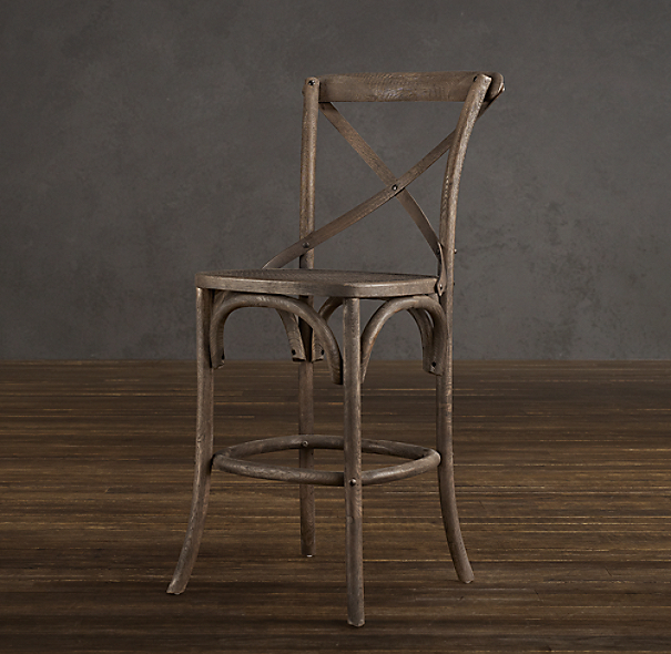
I also really like this style from Restoration Hardware, and it's a total bargain at <$200:

But, I hate it when barstools are uncomfortable, so maybe I want them to be upholstered, which doesn't really work with either of these styles.
And, I do love the all black errything option from RH, which would tie nicely with the black counters and banquette:
&$l-ll1$)
I also have toyed with the idea of doing a fun color for the barstools, since the kitchen is so neutral. I probably won't, but how fun would these world market numbers be in the right space? Love.

Obviously I have yet to make up my mind on this topic, but I need to decide soon. Moving day is now less than 2 weeks out (yikes!).
We've also been making really good progress on the bathrooms, including the install of the wallpaper that has caused my wallpaper lady to swear me off forever. Pretty pictures of that coming soon!


You must to the turquoise!
ReplyDelete